Clients
TOO FACED
For Too Faced, I created visuals that capture the brand’s playful and ultra-feminine essence. Drawing inspiration from its signature pink and gold palette, I incorporated details like hearts, bows, and bold typography to reflect its sparklingpersonality. Each design is thoughtfully crafted to feel fun, flirty, and eye-catching, then seamlessly rolled out across the website and social media to maintain a vibrant and engaging brand presence.
CONTENT CREATION - WEB DESIGN - EMAIL
Visual content creation
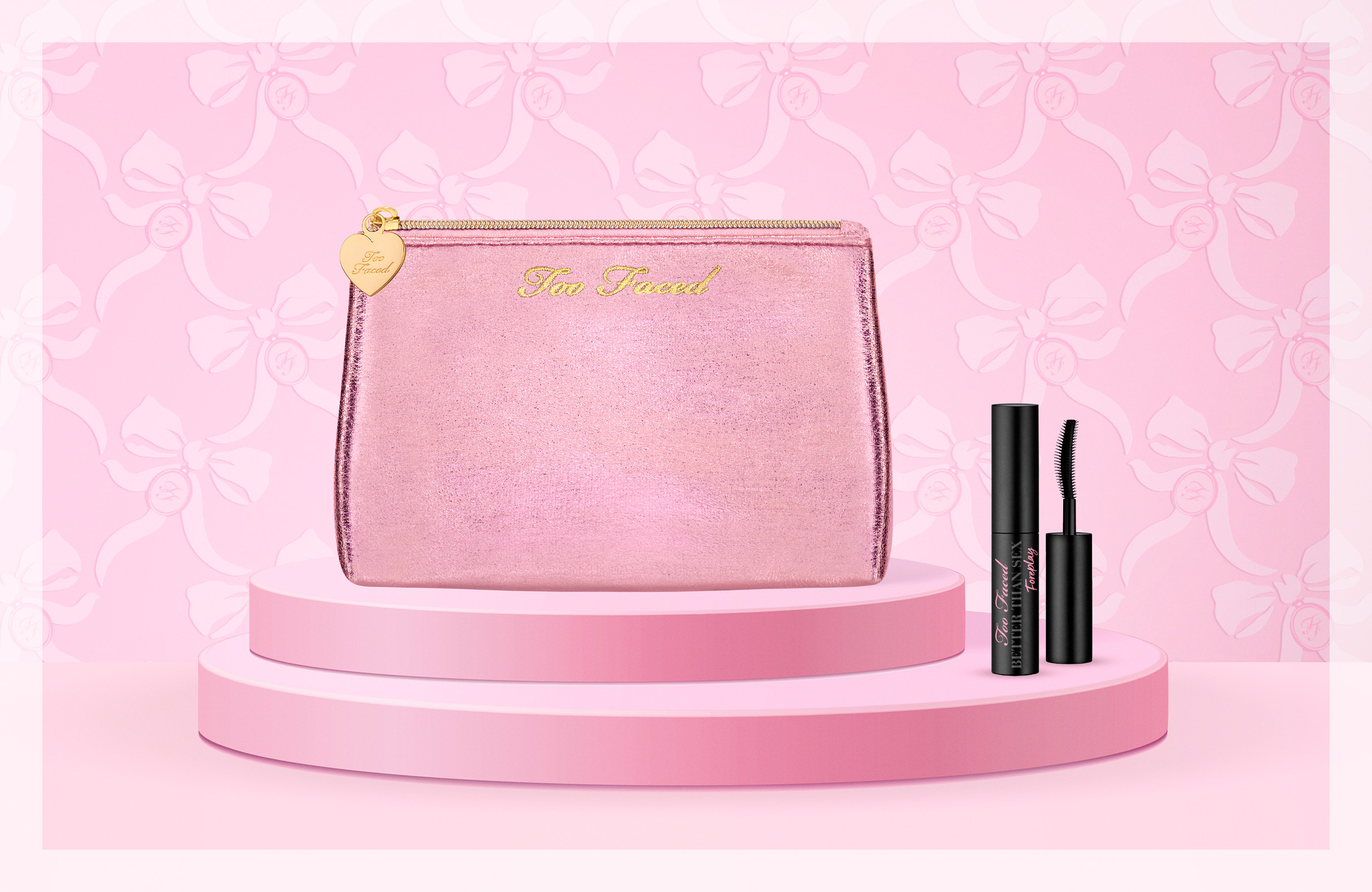
Designed a visual from scratch to promote Too Faced's National Lash Day offer, featuring the Too Faced set displayed on a pink plinth against a pink background. The Too Faced logo and bows were intricately woven into a tapestry, accented with a gold heart badge. The design captured the brand’s girly and vibrant aesthetic.
Digital design
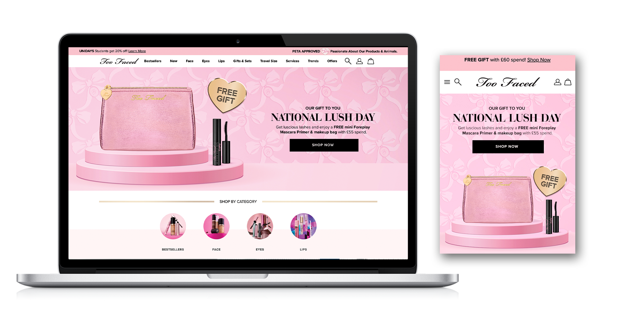
Implemented the visual across the website, and integrating it into the CMS while optimizing the design for a smooth and intuitive user interface. By testing and refining the layout, I ensured a consistent and effortless navigation experience across devices and screen sizes, enhancing the overall user journey.
Email - crm
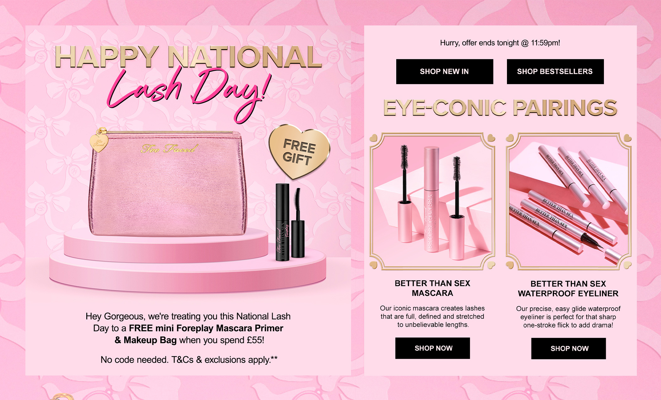
Designed the email the email from scratch and ensuring it aligned with the original visual by incorporating gold elements in the cross-sell section, such as the frames, to reflect the gold badge and essence of Too Faced. The design also featured pink accents and attention-grabbing fonts to maintain brand consistency.
Visual content creation
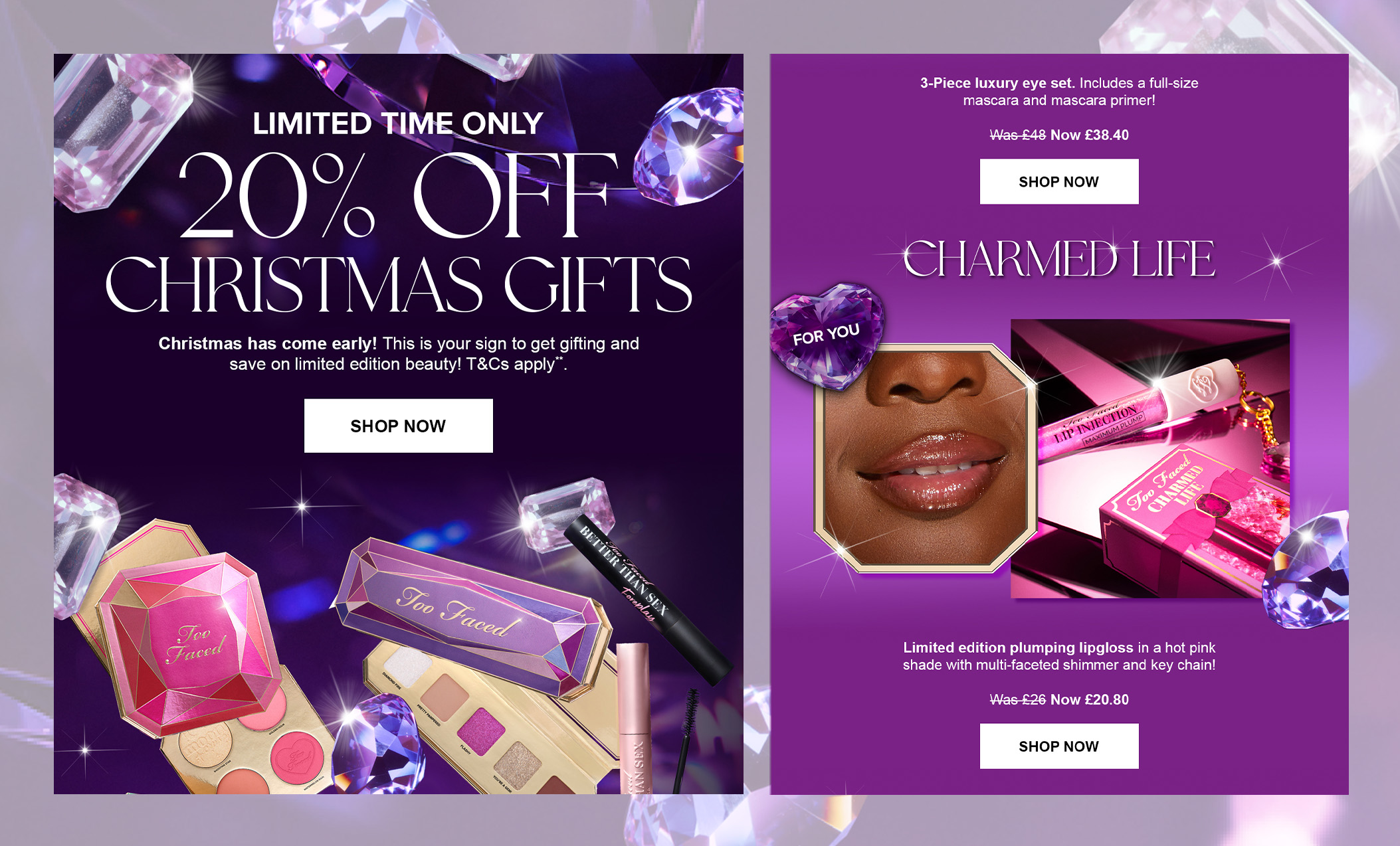
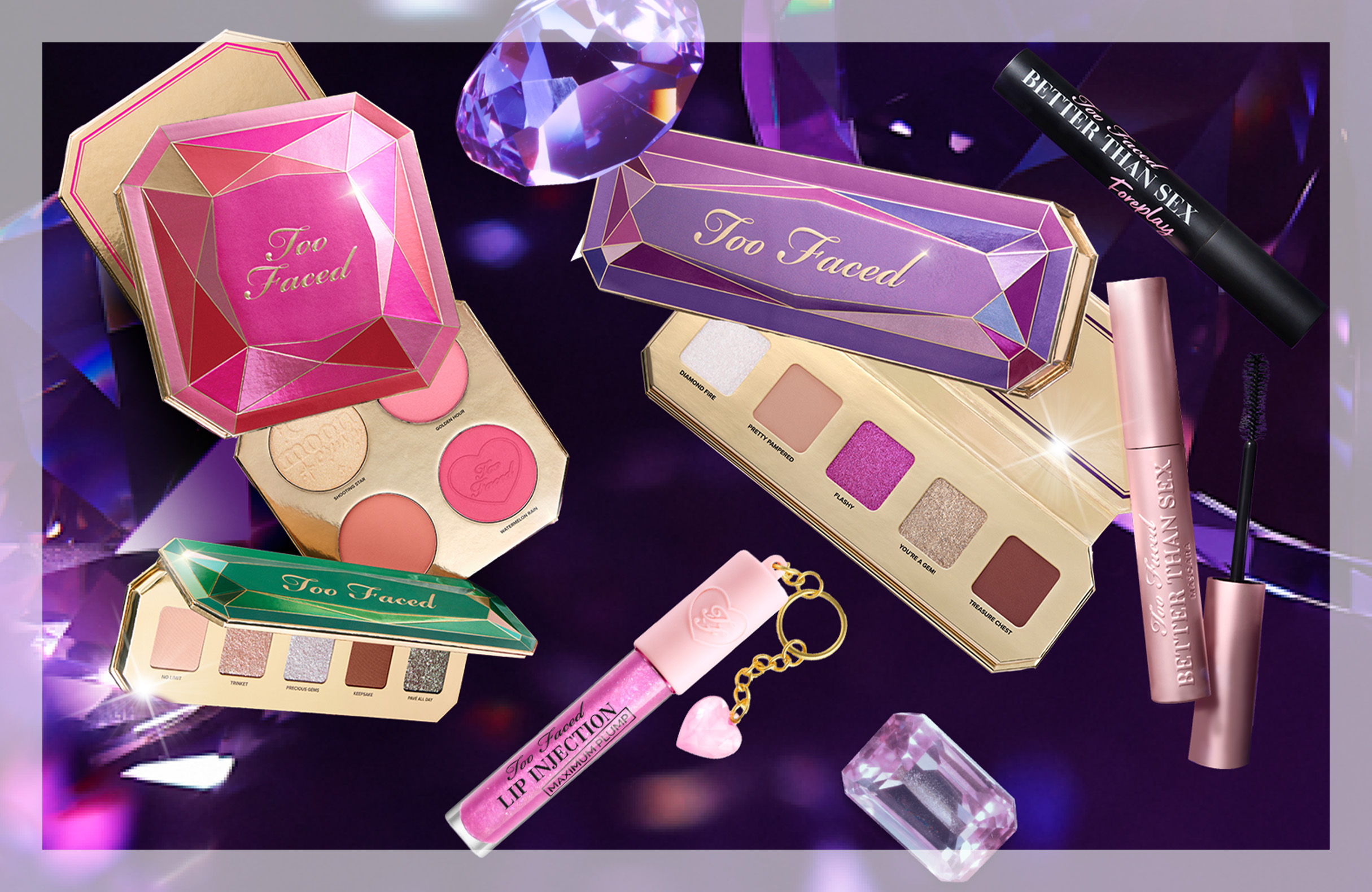
Created a visual from scratch to promote the December gift set, blending the Black Friday and Christmas themes of floating products and sparkling gems. The design highlighted Too Faced’s Christmas Collection, infused with festive holiday glam and adorned with shimmer and sparkle. The goal was to capture the magic of the season while maintaining the signature Too Faced touch.
Email - crm
Email from scratch, aligned with the original visual by incorporating floating purple gems throughout the design, along with golden frames and shapes that echoed the gem motifs. I optimized the layout for mobile devices, ensuring a seamless, responsive experience across all screen sizes, and prioritized accessibility to create an inclusive and user-friendly design.
