Clients
DJ. JART
With the Korean brand Dr. Jart, I created visual designs from scratch to promote their promotional offers. Drawing inspiration from the brand’s vibrant identity and bold, eye-catching colors, I ensure that each design aligns with its dynamic aesthetic. I also rolled out these visuals across all digital platforms, including the website, emails, and social media, ensuring a cohesive and engaging brand presence.
CONTENT CREATION - WEB DESIGN - EMAIL
Visual content creation
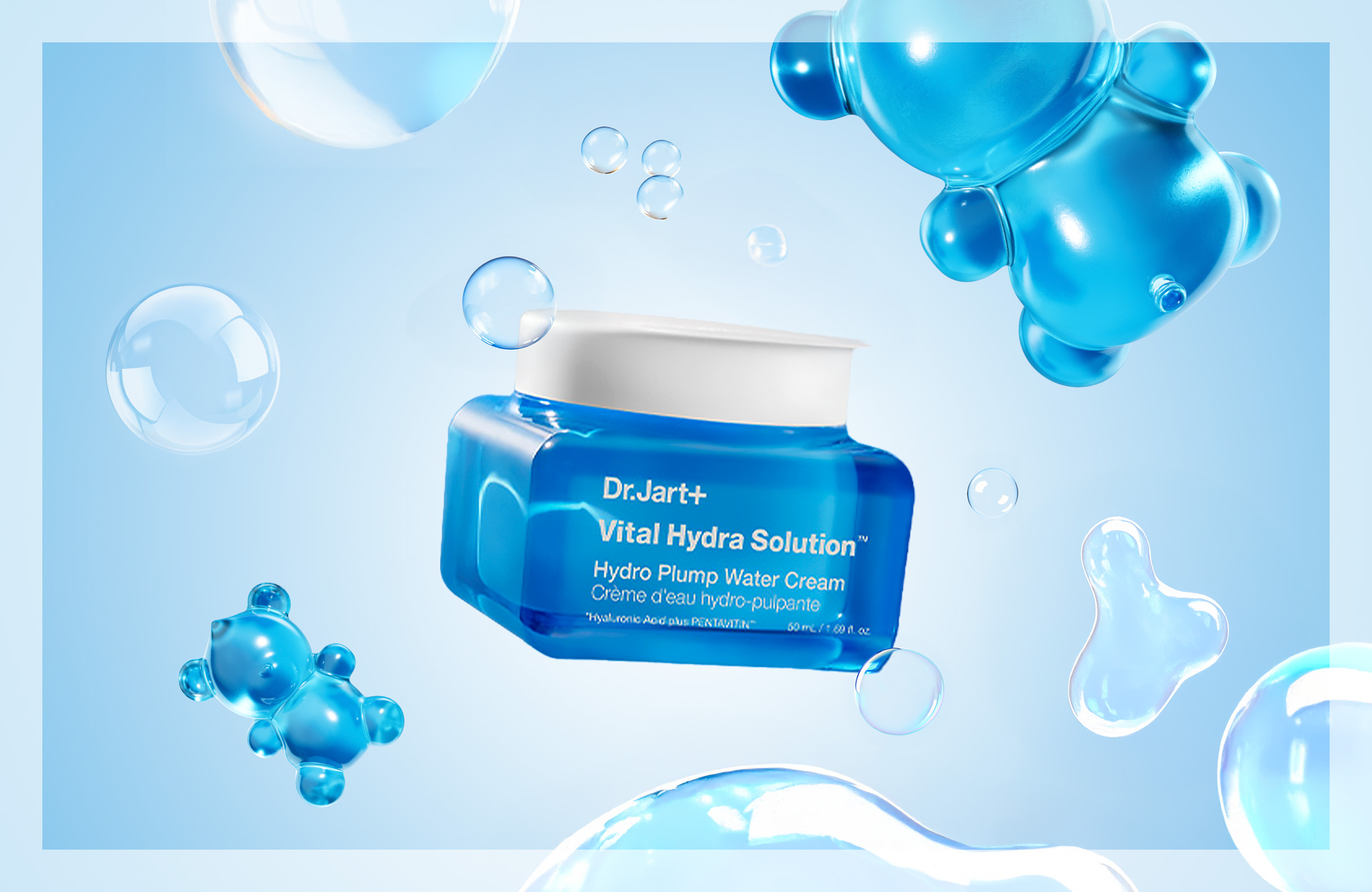
Created a visual from scratch for the launch of the Vital Hydra Solution Hydro Plump Water Cream, focusing on the essence of the product. Using a blue color palette to represent hydration, I incorporated a gelatin blue teddy bear and watery bubbles to evoke the refreshing and moisturizing qualities of the cream.
Digital design
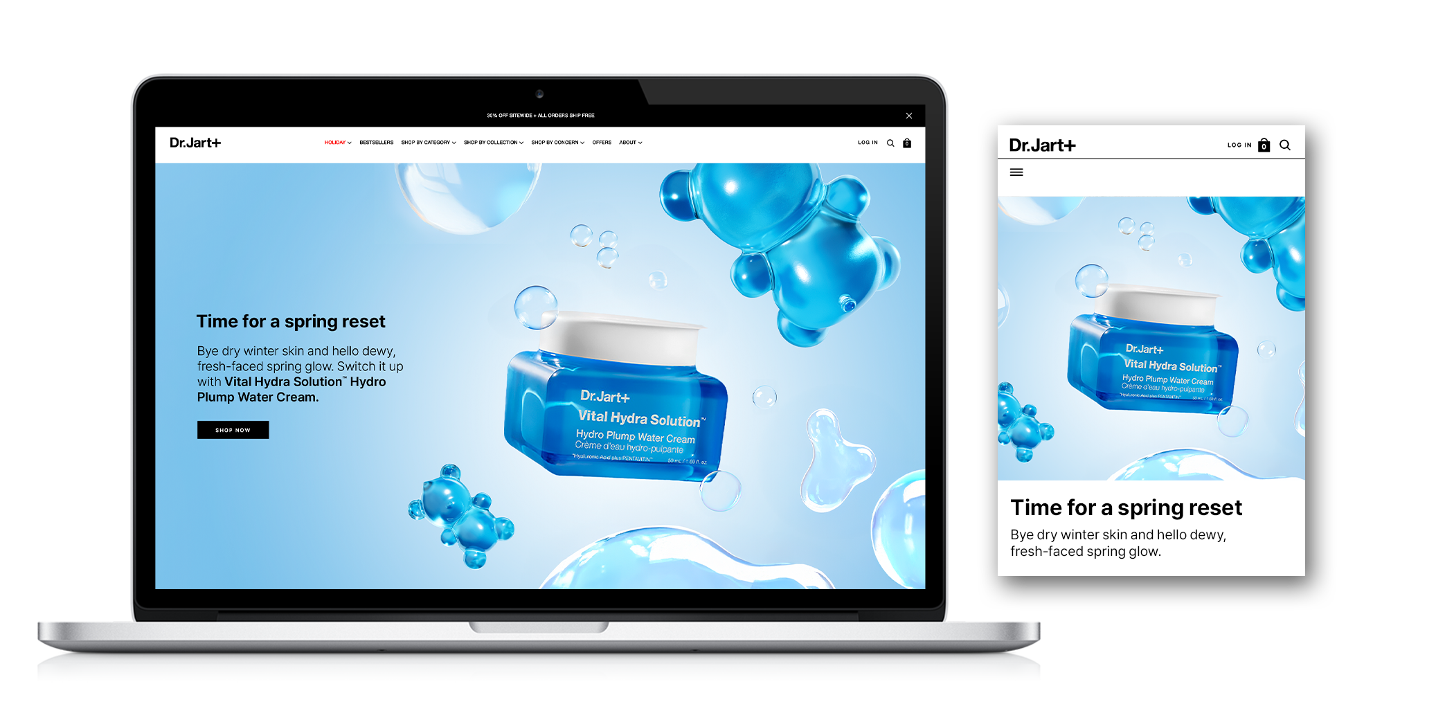
Implemented the visual across the website, seamlessly integrating it into the CMS while optimizing the design for a smooth and intuitive UI. I focused on ensuring a user-friendly experience by testing and refining the layout, making adjustments for consistency and ease of navigation across all devices and screen sizes.
Email - crm
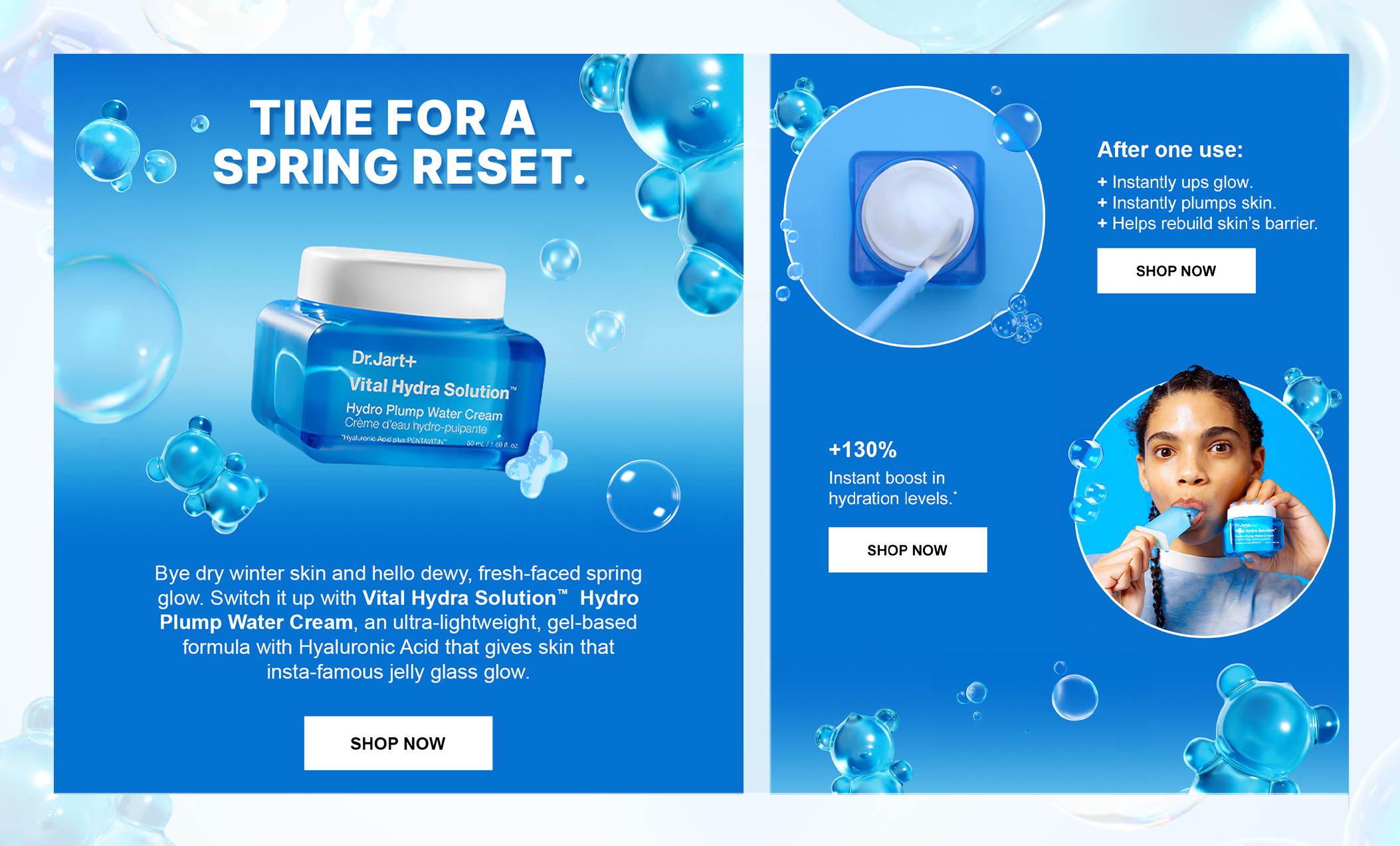
Designed an email from scratch, ensuring it was fully aligned with the original VHS visual by maintaining consistency in the use of blue tones, bubbles, and the teddy bear motif. I optimized the layout for mobile devices, ensuring responsiveness and a seamless experience across all screen sizes. I also prioritized accessibility, ensuring the email was inclusive and user-friendly.
Visual content creation
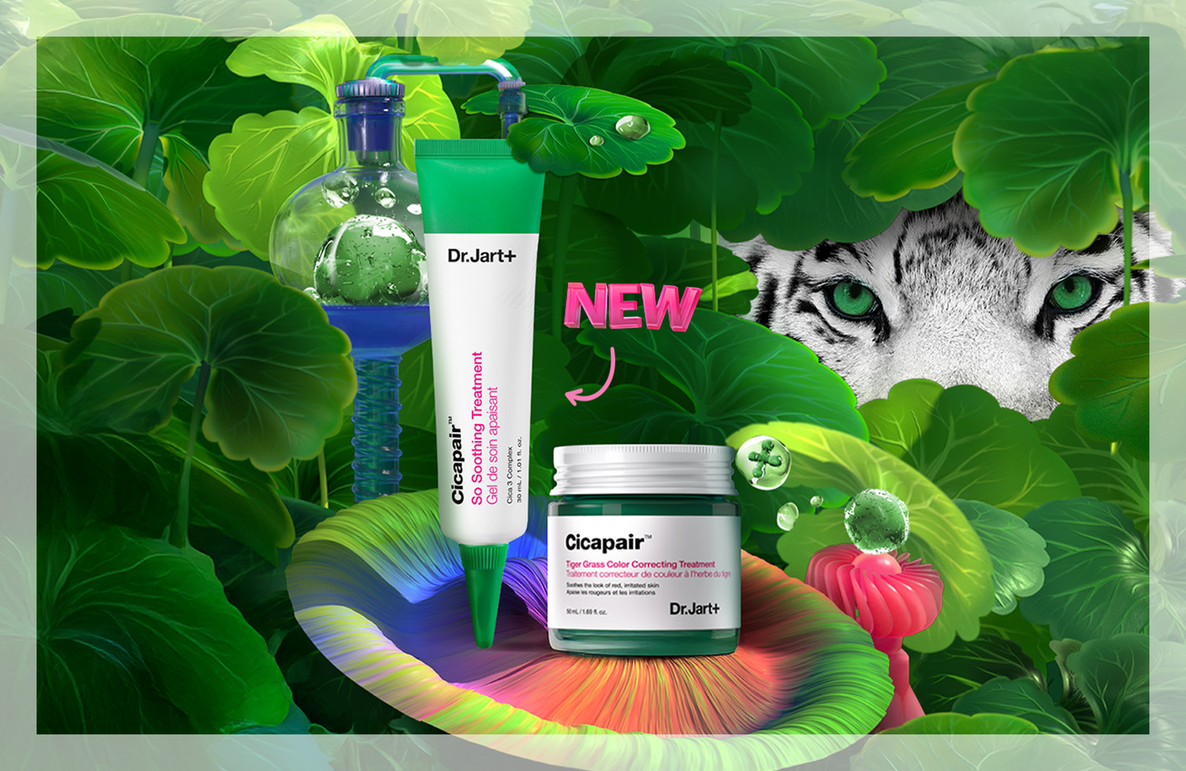
Created a promotional visual for the Cicapair Soothing Treatment Cream launch, featuring the iconic tiger symbols and Centella Asiatica leaves. The challenge was to blend the boldness of the tiger imagery with the cream’s soothing qualities. The final design embodied Dr. Jart’s energetic, playful aesthetic while emphasizing the product’s calming benefits.
Digital design
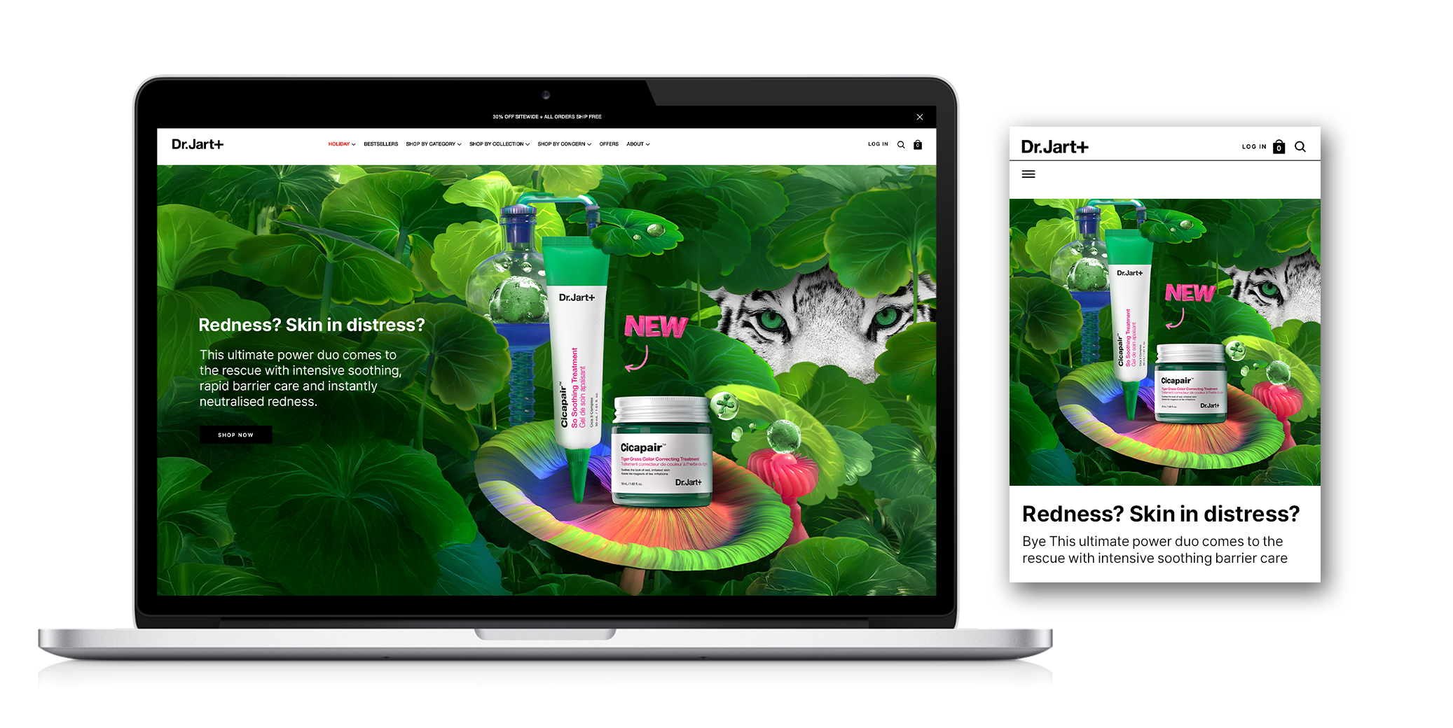
Rolled out the visual across the website, integrating it into the CMS while ensuring the design was optimized for UI and provided a seamless, user-friendly experience. I tested and adjusted the layout to ensure smooth navigation and consistency across all devices.
Email - crm
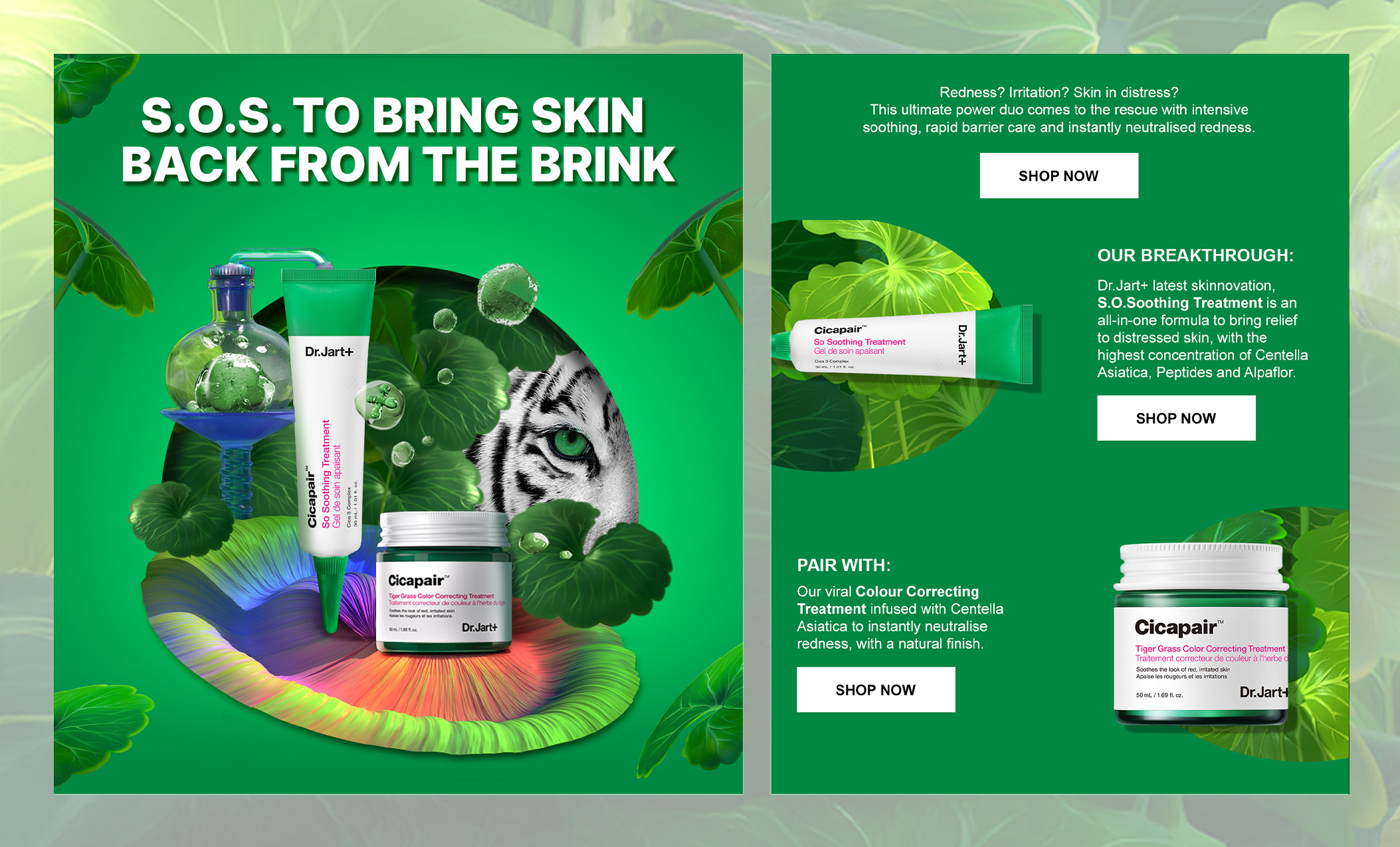
Designed an email from scratch, ensuring it was fully aligned with the original VHS visual by maintaining consistency in the use of blue tones, bubbles, and the teddy bear motif. I optimized the layout for mobile devices, ensuring responsiveness and a seamless experience across all screen sizes. I also prioritized accessibility, ensuring the email was inclusive and user-friendly.
Visual content creation
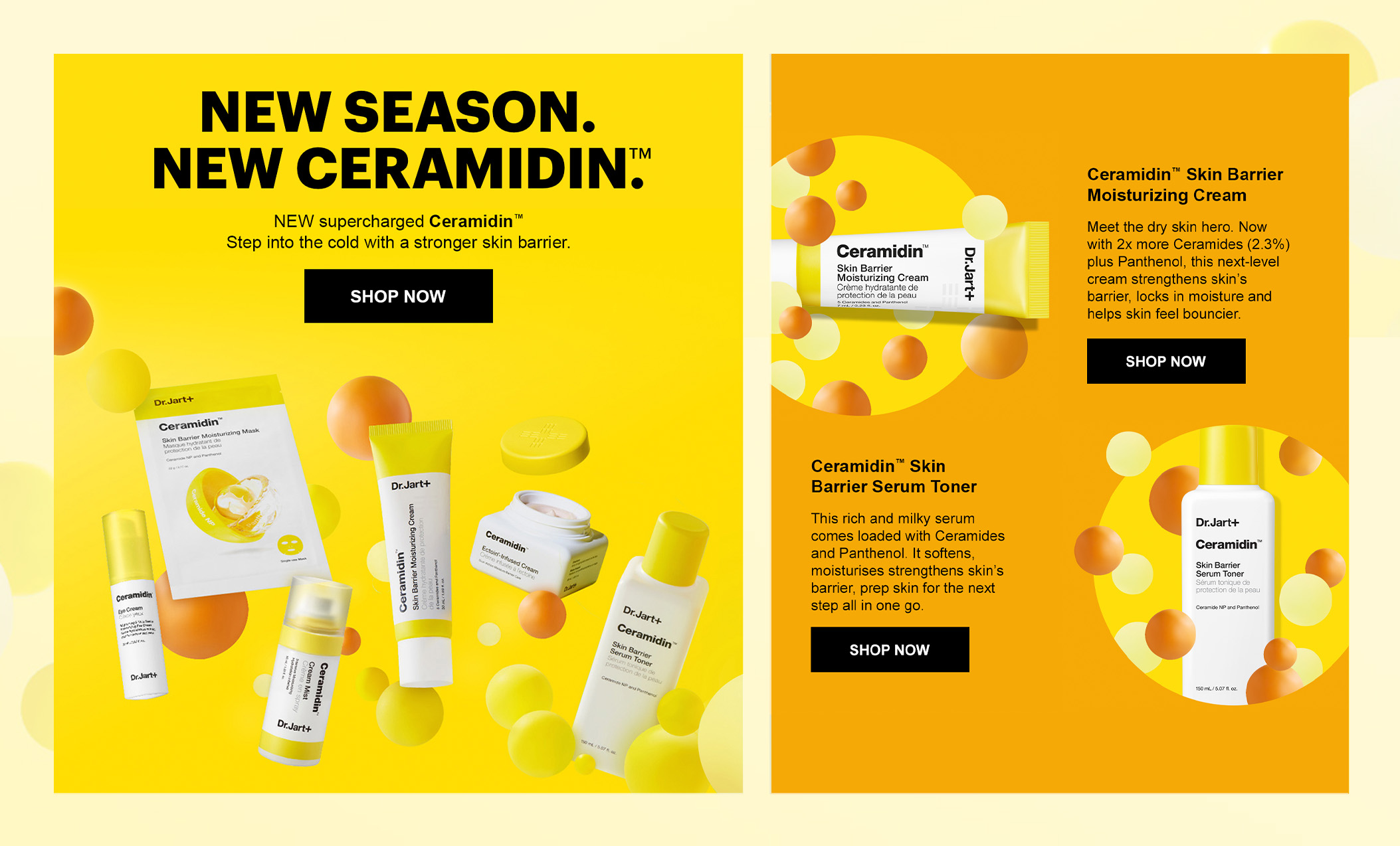
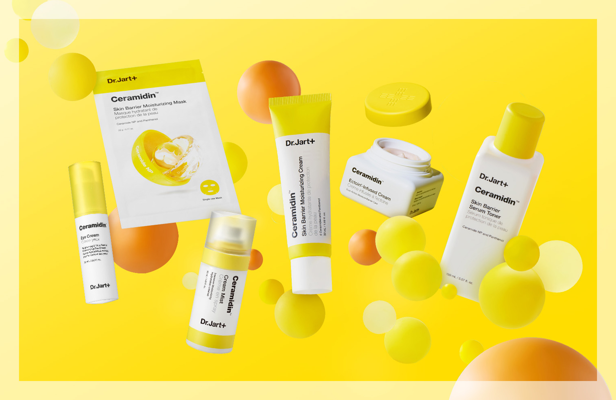
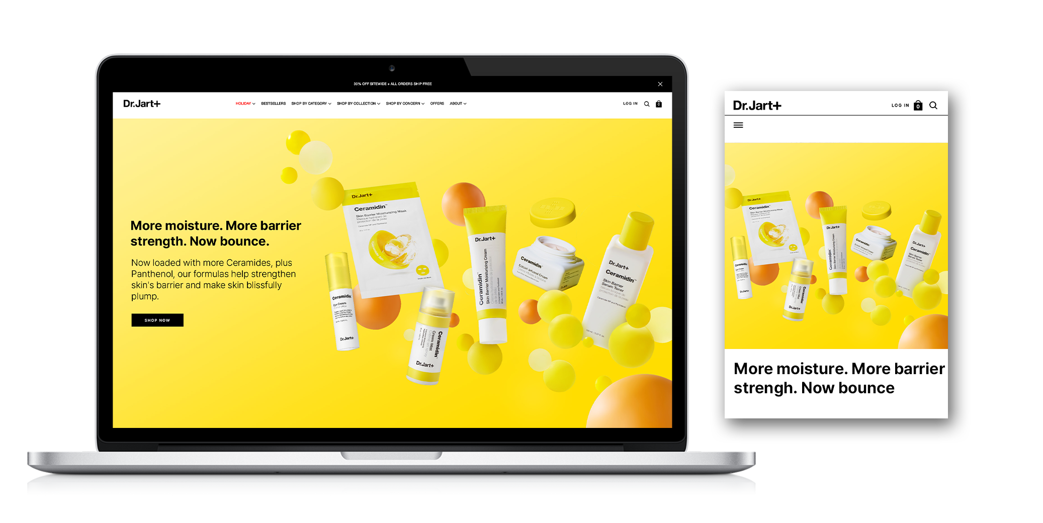
Created a visual from scratch to promote the Ceramidin range, using yellow as the key color to reflect the product’s vibrant, nourishing qualities. The design features the products floating around in a dynamic composition of orange and various shades of yellow, with bubbles enhancing the playful, eye-catching aesthetic.
Digital design
Rolled out the visual across the website, integrating it into the CMS while optimizing the design for a fluid, intuitive UI. I focused on enhancing the user experience by testing and refining the layout, ensuring consistency and effortless navigation across various devices and screen sizes.
Email - crm
Designed an email from scratch, aligning it with the original Ceramidin visual by incorporating consistent use of yellow, orange, and the bubble motif. I optimized the layout for mobile devices to ensure a responsive, seamless experience across all screen sizes. Additionally, I focused on accessibility, making sure the email was inclusive and easy to navigate for all users.
